


In the last article, titled “Exploring React Native”, we used a few components to create a simple app. The app consisted of an Image component, a couple Text components, data that changed with user interaction, and a couple of buttons created with the Button component and TouchableOpacity component. We styled each component and at the end, had a counter app.
But there are a lot of components we did not cover and the ones we did cover, can be used in other ways. So, in this article, we will continue to use the project from the previous article to learn more about React Native’s components. The components we will be focusing on in this article are the ScrollView and View components. The ScrollView component is similar to View but allows for scrolling. The View component is one that we used in the previously but in this article, we will be using it to create sections in the app. As well, we will be passing a network image to the Image component and will learn a bit more about styling.
Let’s get started!
More Built In Components
I will be working on a Mac using Visual Studio Code as my editor, run the app on the iOS simulator and will be working with the “FirstRNProject” project. If you are using Windows or are targeting Android, I will test the app on the Android emulator at the end of the article. This code will also work if you are using Expo and will also be tested later on.
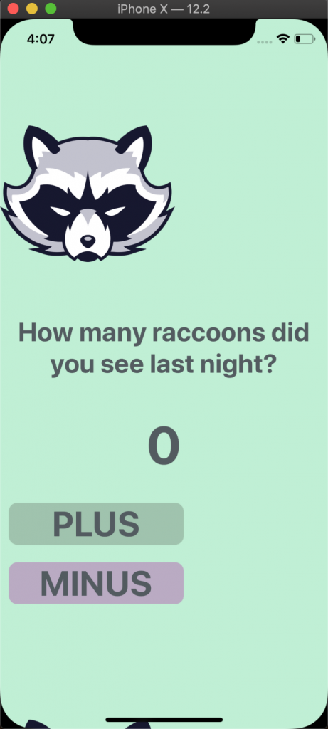
Open the App.js file and this is what we have from last time:
import React, { Component } from 'react';

import { Button, Image, StyleSheet, Text, TouchableOpacity, View } from 'react-native';

const styles = StyleSheet.create({

container: {

flex: 1,

backgroundColor: '#bff0d4',

alignItems: 'center',

},

image: {

height: 200,

width: 200,

marginTop: 100,

marginBottom: 20

},

question: {

fontSize: 30,

fontWeight: 'bold',

textAlign: 'center',

color: '#535B60',

padding: 20

},

number: {

fontSize: 60,

fontWeight: 'bold',

textAlign: 'center',

color: '#535B60',

padding: 20

},

plusButton: {

backgroundColor: '#9FC4AD',

width: 200,

borderRadius: 10,

margin: 10

},

minusButton: {

backgroundColor: '#BAAAC4',

width: 200,

borderRadius: 10,

margin: 10

},

buttonText: {

fontSize: 40,

fontWeight: 'bold',

textAlign: 'center',

color: '#535B60'

}

});

class App extends Component {

state = {

raccoons: 0

};

addMore = () => {

this.setState({

raccoons: this.state.raccoons + 1

})

}

removeOne = () => {

if(this.state.raccoons !== 0){

this.setState({

raccoons: this.state.raccoons - 1

})

}

}

render() {

return (

<View style={styles.container}>

<Image style={styles.image} resizeMode='contain' source={require('./img/raccoon.png')} />

<Text style={styles.question} >How many raccoons did you see last night?</Text>

<Text style={styles.number}>{this.state.raccoons}</Text>

<TouchableOpacity onPress={this.addMore} style={styles.plusButton} >

<Text style={styles.buttonText}>PLUS</Text>

</TouchableOpacity>

<TouchableOpacity onPress={this.removeOne} style={styles.minusButton}>

<Text style={styles.buttonText}>MINUS</Text>

</TouchableOpacity>

</View>

)

}

}

export default App;
First a quick recap of the code above.
We first imported the components we were going to use from React Native. These components were the Button, Image, StyleSheet, Text, TouchableOpacity and View components. Then we created a styles variables that contained all the styling objects we used to style the components. After that, we created a state for the counter which would change with the pressing of either “PLUS” or “MINUS” buttons. Then inside the render function we had a View component that wrapped the Image, Text and TouchableOpacity components and each was styled accordingly.
Open the Terminal or Command Prompt to run the project. If you are using Visual Studio Code, there is an “integrated terminal, initially starting at the root of your workspace.” Using this terminal, you can run the React Native iOS/Android start commands, or if using Expo, the Expo start command from the editor. You can learn more about Visual Studio Code’s terminal here, http://code.visualstudio.com/docs/editor/integrated-terminal. What you will have is the following:
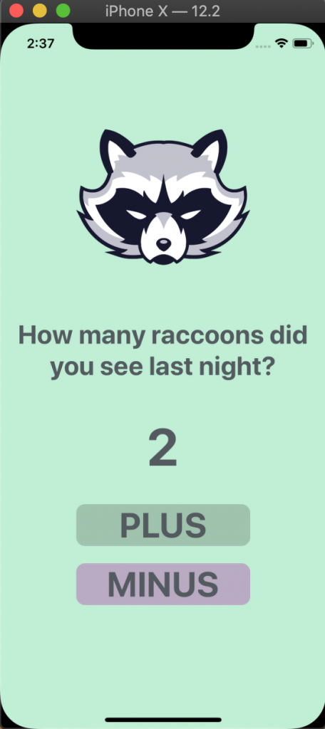
The app looks great but what if we wanted to create a list of animals, each with its own image, text, counter and buttons? Well, let’s copy the components between the View tags and paste them right after the “MINUS” button but before the closing View tag. Your code will look like this:
<View style={styles.container}>

{/* Raccoon One */}

<Image style={styles.image} resizeMode='contain' source={require('./img/raccoon.png')} />

<Text style={styles.question} >How many raccoons did you see last night?</Text>

<Text style={styles.number}>{this.state.raccoons}</Text>

<TouchableOpacity onPress={this.addMore} style={styles.plusButton} >

<Text style={styles.buttonText}>PLUS</Text>

</TouchableOpacity>

<TouchableOpacity onPress={this.removeOne} style={styles.minusButton}>

<Text style={styles.buttonText}>MINUS</Text>

</TouchableOpacity>

{/* Raccoon Two */}

<Image style={styles.image} resizeMode='contain' source={require('./img/raccoon.png')} />

<Text style={styles.question} >How many raccoons did you see last night?</Text>

<Text style={styles.number}>{this.state.raccoons}</Text>

<TouchableOpacity onPress={this.addMore} style={styles.plusButton} >

<Text style={styles.buttonText}>PLUS</Text>

</TouchableOpacity>

<TouchableOpacity onPress={this.removeOne} style={styles.minusButton}>

<Text style={styles.buttonText}>MINUS</Text>

</TouchableOpacity>

</View>
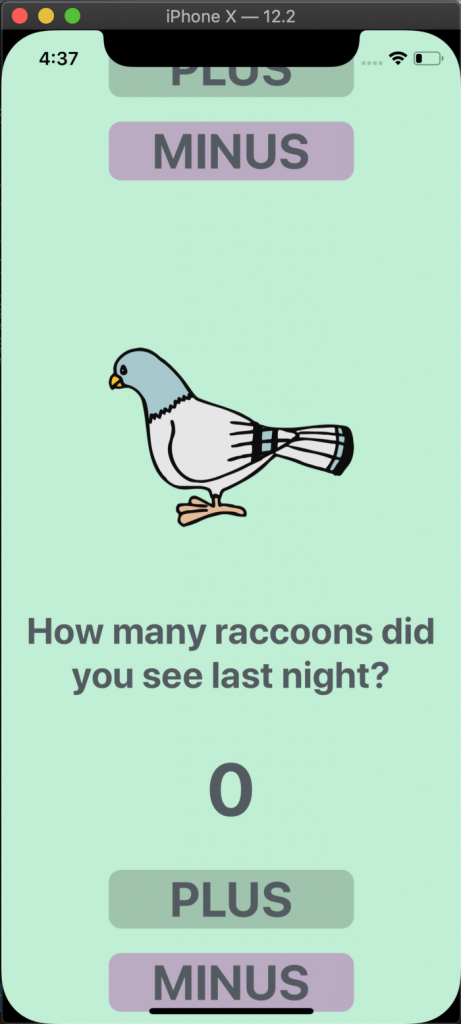
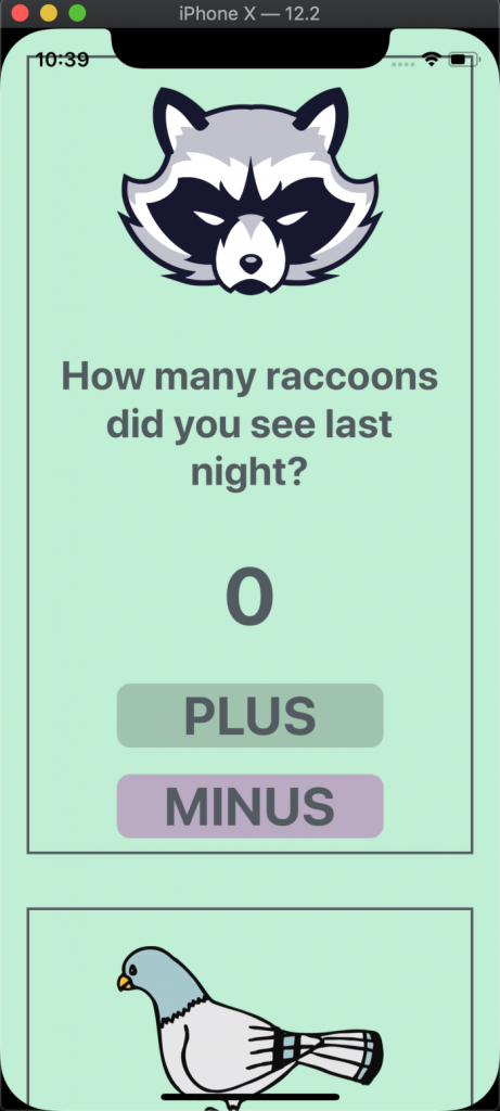
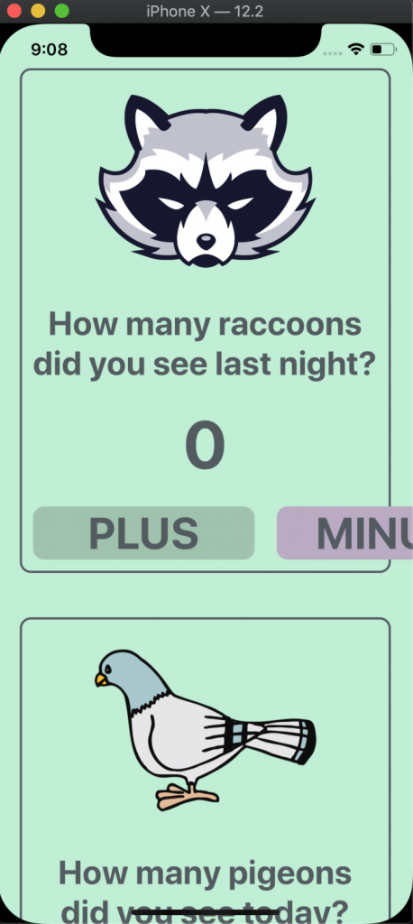
When you save the file and reload the app, you will see this:
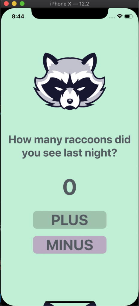
That doesn’t look right. We can barely see that there is another image of a raccoon at the bottom of the screen and we can’t scroll down to view the rest of the app. In order for the app to scroll we will use the ScrollView component. According to the React Native documentation, “The ScrollView is a generic scrolling container that can host multiple components and views.” There is another option we could use, called FlatList. The difference between the two, is that, ScrollView renders all of its children components, or the components between its tags, at once. While FlatList renders its items when they appear on the screen and removes them once off the screen. Therefore, if you have a large list, using ScrollView will slow down rendering and increase memory usage. For this app, our list will be short and ScrollView will be used but in later articles we will be using the FlatList component.
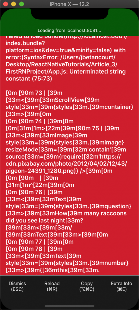
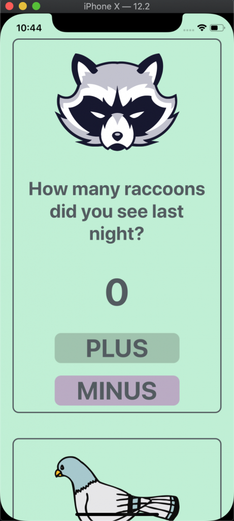
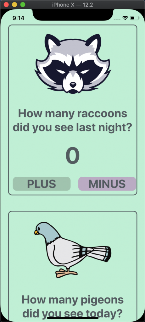
Let’s first import the ScrollView component and replace the View tags with ScrollView, save the file and reload. This is what will happen:
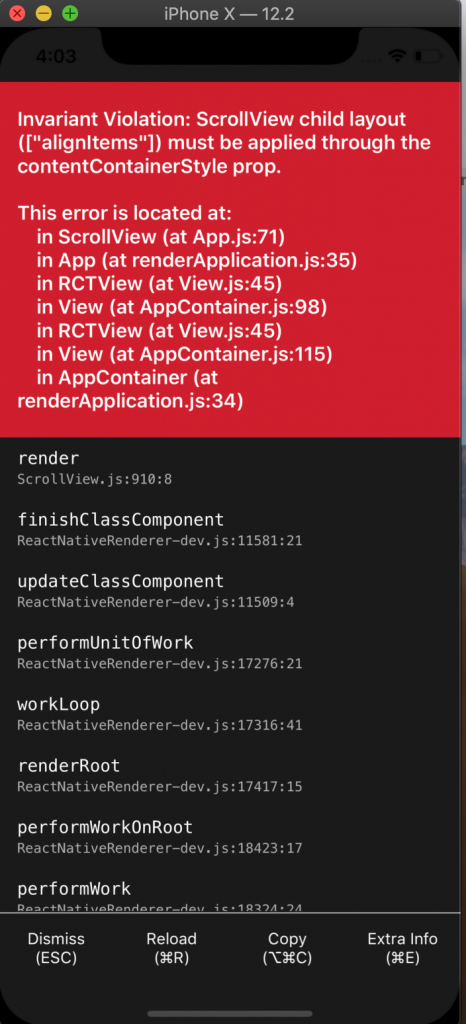
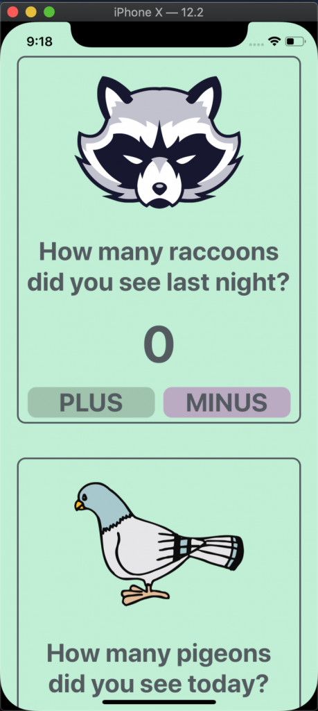
This error occurs because of the layout prop “alignItems: ‘center’” that is passed to the styling of the ScrollView components. To fix it remove “alignItems: ‘center’” from “container” in styles. Save the file, reload and now the app will look like this:
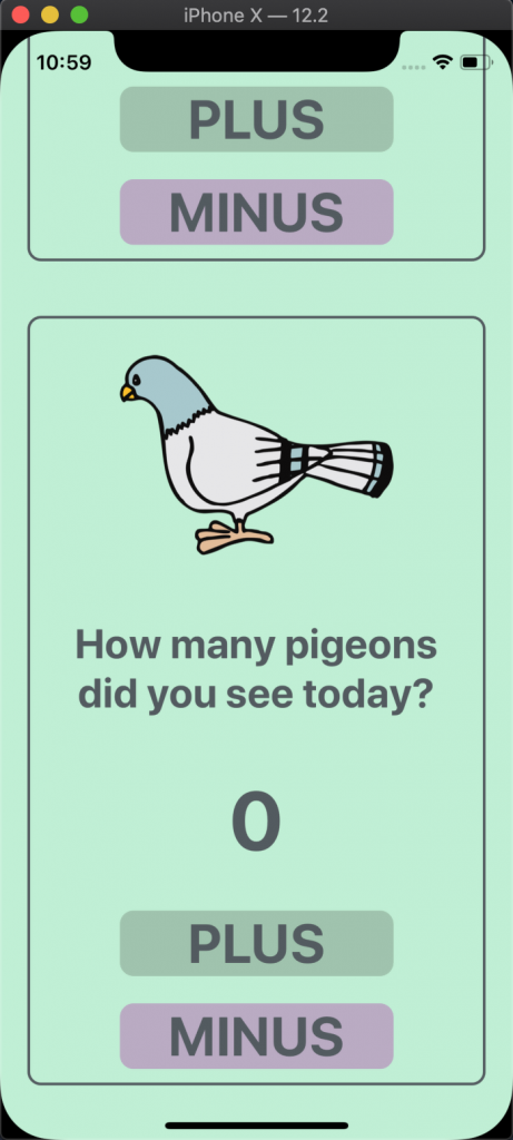
It’s not perfect but we can now scroll to through the app and see the second image, along with the text and buttons. To fix the styling of the images and buttons simply add “alignSelf: ‘center’” to the “image”, “plusButton” and “minusButton” styles.
image: {

height: 200,

width: 200,

marginTop: 100,

marginBottom: 20,

alignSelf: 'center'

},

plusButton: {

backgroundColor: '#9FC4AD',

width: 200,

borderRadius: 10,

margin: 10,

alignSelf: 'center'

},

minusButton: {

backgroundColor: '#BAAAC4',

width: 200,

borderRadius: 10,

margin: 10,

alignSelf: 'center'

},
Great! Everything is now centered and we can scroll.
It doesn’t make sense to keep track of the number of raccoons twice, so let’s find an image of another animal online.
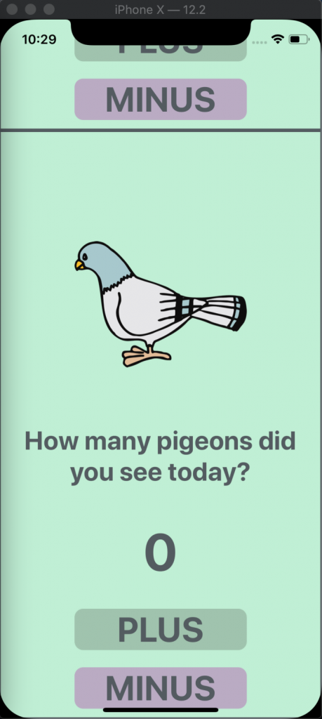
If you recall, in the previous article we saved the image of the raccoon in our project under the ‘img’ folder, then passed it to the Image component. By doing so we were using a static image. The Image component can display various types of images and what I want to do now is use a network image. I went online and found an image of a pigeon and got the URL to the image.
Now if you replace the location of the second raccoon image with an URL, like this:
<Image style={styles.image} resizeMode='contain' source={require('http://cdn.pixabay.com/photo/2012/04/02/12/43/pigeon-24391_1280.png')} />
Then you will get an error like this:
That’s because, passing a network image is a little different than passing a static image. Inside of “source={}”, replace it with “{uri: ‘URL_OF_THE_IMAGE’}”. It will look like this:
<Image style={styles.image} resizeMode='contain' source={{ uri: ‘URL_OF_THE_IMAGE’ }} />
So if we replace ‘URL_OF_THE_IMAGE’ with the actual URL, we will have this:
<Image style={styles.image} resizeMode='contain' source={{ uri: 'http://cdn.pixabay.com/photo/2012/04/02/12/43/pigeon-24391_1280.png' }} />
Another key difference between static and network images is that, network images require that the dimensions of the image be specified. Our ‘image’ style object has specified width and height dimension, so our image will appear. Had those dimension not been there, the image would not be displayed.
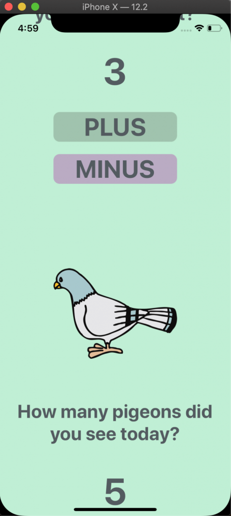
Save the file and reload the app to get this:
Now I know not everyone likes this bird but I liked how it looked and it a bird, I would say, most people see on a regular basis. You can choose another bird or another animal entirely, it’s totally up to you. There’s just a couple more things that need changing, such as the text, adding the new counter data to the state and creating new functions for the new pigeon buttons.
Changing the text is simple, go to the Text component that corresponds to the second animal, in my case the pigeon, and change it to something like, “How many pigeons did you see today?”. Then add “pigeons: 0” to the state and replace “{this.state.raccoons}” with “{this.state.pigeons}” in the following Text component. Next we can rename the existing functions for the buttons to “addRaccoons” and “removeRaccoons” then copy and paste them right below. For the second set of functions, replace “raccoons” with “pigeons”. Remember to keep the camel case coding style and capitalize the “P” in pigeon. Also don’t forget to go to the TouchableOpacity components and rename the functions accordingly. If you are having any issues, here is the code:
class App extends Component {

state = {

raccoons: 0,

pigeons: 0

};

//Raccoon Functions

addRaccoons = () => {

this.setState({

raccoons: this.state.raccoons + 1

})

}

removeRaccoons = () => {

if(this.state.raccoons !== 0){

this.setState({

raccoons: this.state.raccoons - 1

})

}

}

//Pigeon Functions

addPigeons = () => {

this.setState({

pigeons: this.state.pigeons + 1

})

}

removePigeons = () => {

if(this.state.pigeons !== 0){

this.setState({

pigeons: this.state.pigeons - 1

})

}

}

render() {

return (

<ScrollView style={styles.container}>

{/* Raccoon */}

<Image style={styles.image} resizeMode='contain' source={require('./img/raccoon.png')} />

<Text style={styles.question} >How many raccoons did you see last night?</Text>

<Text style={styles.number}>{this.state.raccoons}</Text>

<TouchableOpacity onPress={this.addRaccoons} style={styles.plusButton} >

<Text style={styles.buttonText}>PLUS</Text>

</TouchableOpacity>

<TouchableOpacity onPress={this.removeRaccoons} style={styles.minusButton}>

<Text style={styles.buttonText}>MINUS</Text>

</TouchableOpacity>

{/* Pigeon */}

<Image style={styles.image} resizeMode='contain' source={{ uri: 'http://cdn.pixabay.com/photo/2012/04/02/12/43/pigeon-24391_1280.png' }} />

<Text style={styles.question} >How many pigeons did you see today?</Text>

<Text style={styles.number}>{this.state.pigeons}</Text>

<TouchableOpacity onPress={this.addPigeons} style={styles.plusButton} >

<Text style={styles.buttonText}>PLUS</Text>

</TouchableOpacity>

<TouchableOpacity onPress={this.removePigeons} style={styles.minusButton}>

<Text style={styles.buttonText}>MINUS</Text>

</TouchableOpacity>

</ScrollView>

)

}

}
I’ve added comments, “{/* Raccoon */}” and “{/* Pigeon */}”, to help indicate that the following set of code corresponds to a particular animal. Writing comments can help you identify sections of code, especially once the code starts to get long and complicated. One thing to note is that when commenting inside JSX, where tags are used like in the above, you need to wrap the comment inside of “{/* YOUR_COMMENT */}”. Outside of JSX, you can use “// YOUR_COMMENT” for a single line comment or “/* YOUR_COMMENT */” for a multi-line comment.
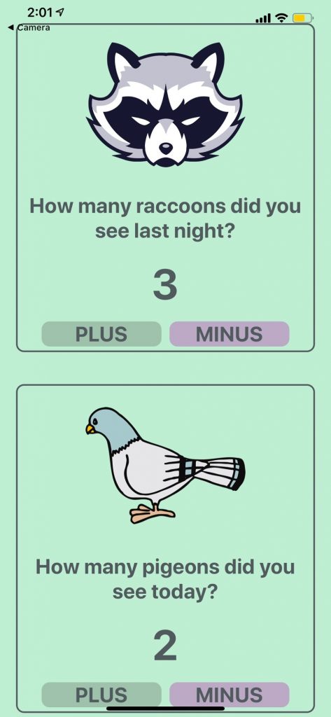
Once saved and reloaded, you will be able to scroll through the app and press the buttons to increase or decrease the counters. Here is how it will look:
Great! Let’s now work on styling the app a bit more by using React Native’s View component.
Right now the app is one continuous page with images, text and buttons. To help separate each section and make the app more user friendly, we will create a border around the raccoon and pigeon set of components. It’s like creating a card for each animal and the card contains all the content for that one subject. This can simply be done by wrapping each set of components in a View and passing it a set of styles.
First, import the View component if you deleted it and create two set of opening and closing View tags. Then copy the set of raccoon components and paste them inside the first View. Repeat for the pigeon components but paste those in the second View. This is what you should have:
<ScrollView style={styles.container}>

{/* Raccoon */}

{/* First View */}

<View>

<Image style={styles.image} resizeMode='contain' source={require('./img/raccoon.png')} />

<Text style={styles.question} >How many raccoons did you see last night?</Text>

<Text style={styles.number}>{this.state.raccoons}</Text>

<TouchableOpacity onPress={this.addRaccoons} style={styles.plusButton} >

<Text style={styles.buttonText}>PLUS</Text>

</TouchableOpacity>

<TouchableOpacity onPress={this.removeRaccoons} style={styles.minusButton}>

<Text style={styles.buttonText}>MINUS</Text>

</TouchableOpacity>

</View>

{/* Pigeon */}

{/* Second View */}

<View>

<Image style={styles.image} resizeMode='contain' source={{ uri: 'http://cdn.pixabay.com/photo/2012/04/02/12/43/pigeon-24391_1280.png' }} />

<Text style={styles.question} >How many pigeons did you see today?</Text>

<Text style={styles.number}>{this.state.pigeons}</Text>

<TouchableOpacity onPress={this.addPigeons} style={styles.plusButton} >

<Text style={styles.buttonText}>PLUS</Text>

</TouchableOpacity>

<TouchableOpacity onPress={this.removePigeons} style={styles.minusButton}>

<Text style={styles.buttonText}>MINUS</Text>

</TouchableOpacity>

</View>

</ScrollView>
We will now create a new set of styles called “cardStyle” and pass it to both View components. To “cardStyle”, we will add a border color and width. This will create the border around each set of components.
cardStyle: {

borderColor: '#535B60',

borderWidth: 2

}
Save the file and reload the app. Wait a minute, this doesn’t look right.
I can see that there is a line separating the raccoon and pigeon cards but that’s about it. We will need to style this some more.
First add “margin: 20” to “cardStyle”, this will create space between the outside of the border and the edge of the screen. We can then go into the “image” style and remove both margins.
Looking better but I don’t like the border, it’s too boxy. This is a quick fix, add “borderRadius: 10” to “cardStyle”. Also notice that the top border of the raccoon card is being cut off by the iPhone X notch. Let’s add “paddingTop: 20” to the “container” style.
Looking awesome! Our styling is as follows:
const styles = StyleSheet.create({

container: {

flex: 1,

backgroundColor: '#bff0d4',

paddingTop: 20

},

image: {

height: 200,

width: 200,

alignSelf: 'center'

},

question: {

fontSize: 30,

fontWeight: 'bold',

textAlign: 'center',

color: '#535B60',

padding: 20

},

number: {

fontSize: 60,

fontWeight: 'bold',

textAlign: 'center',

color: '#535B60',

padding: 20

},

plusButton: {

backgroundColor: '#9FC4AD',

width: 200,

borderRadius: 10,

margin: 10,

alignSelf: 'center'

},

minusButton: {

backgroundColor: '#BAAAC4',

width: 200,

borderRadius: 10,

margin: 10,

alignSelf: 'center'

},

buttonText: {

fontSize: 40,

fontWeight: 'bold',

textAlign: 'center',

color: '#535B60'

},

cardStyle: {

borderColor: '#535B60',

borderWidth: 2,

margin: 20,

borderRadius: 10,

}

});
Before continuing with styling, I would like to over the different ways you can style a component.
Although not mentioned before, you can simply pass styles to a component using inline styling. Here is an example:
<View style={{ flex: 1, borderColor: ‘red’, borderWidth: 2 }} >
Or, as we have been doing, we can put all the styling in one location and reference it when needed like this:
const styles = StyleSheet.create({

container: {

flex: 1,

borderColor: ‘red’,

borderWidth: 2

}

});

<View style={styles.cardStyle}>
Both styling methods will style the component the same, but by having the styling outside of the render function, we are making the code cleaner and easier to read.
We can also mix and use both by passing style an array, which can help has pass specific styling to only one particular component, while also passing a set of styles other components use. Here is an example:
<View style={[ styles.container, { margin: 20 } ]} >
The styling is almost perfect but I want to add a bottom margin to the pigeon’s View component because I want some spacing between the bottom of the screen and the bottom of the pigeon card. We will pass “cardStyle” and “marginBottom: 60” to only the second View component. Here is how it is done:
{/* Pigeon */}

{/* Second View */}

<View style={[styles.cardStyle, {marginBottom: 60}]}>

<Image style={styles.image} resizeMode='contain' source={{ uri: 'http://cdn.pixabay.com/photo/2012/04/02/12/43/pigeon-24391_1280.png' }} />

<Text style={styles.question} >How many pigeons did you see today?</Text>

<Text style={styles.number}>{this.state.pigeons}</Text>

<TouchableOpacity onPress={this.addPigeons} style={styles.plusButton} >

<Text style={styles.buttonText}>PLUS</Text>

</TouchableOpacity>

<TouchableOpacity onPress={this.removePigeons} style={styles.minusButton}>

<Text style={styles.buttonText}>MINUS</Text>

</TouchableOpacity>

</View>
The bottom of the pigeon card is visible. This is looking great!
Continuing to focus on styling, let’s have the two buttons placed next to each other. Here we will be using the View component again. First inside the raccoon’s View component create a View right after the counter text. Then copy and paste both TouchableOpacity components inside of the View tags. Then inside the pigeon’s View component, do the same for those buttons.
<ScrollView style={styles.container}>

{/* Raccoon */}

<View style={styles.cardStyle}>

<Image style={styles.image} resizeMode='contain' source={require('./img/raccoon.png')} />

<Text style={styles.question} >How many raccoons did you see last night?</Text>

<Text style={styles.number}>{this.state.raccoons}</Text>

{/* Raccoon Buttons */}

<View>

<TouchableOpacity onPress={this.addRaccoons} style={styles.plusButton} >

<Text style={styles.buttonText}>PLUS</Text>

</TouchableOpacity>

<TouchableOpacity onPress={this.removeRaccoons} style={styles.minusButton}>

<Text style={styles.buttonText}>MINUS</Text>

</TouchableOpacity>

</View>

</View>

{/* Pigeon */}

<View style={[styles.cardStyle, {marginBottom: 60}]}>

<Image style={styles.image} resizeMode='contain' source={{ uri: 'http://cdn.pixabay.com/photo/2012/04/02/12/43/pigeon-24391_1280.png' }} />

<Text style={styles.question} >How many pigeons did you see today?</Text>

<Text style={styles.number}>{this.state.pigeons}</Text>

{/* Pigeon Buttons */}

<View>

<TouchableOpacity onPress={this.addPigeons} style={styles.plusButton} >

<Text style={styles.buttonText}>PLUS</Text>

</TouchableOpacity>

<TouchableOpacity onPress={this.removePigeons} style={styles.minusButton}>

<Text style={styles.buttonText}>MINUS</Text>

</TouchableOpacity>

</View>

</View>

</ScrollView>
If you save the file and reload the app, you will notice that nothing happens. We will need to create a new style called “buttonRow”, pass it “flexDirection: ‘row’”, then pass this style to the buttons’ View components. By default “flexDirection” is set to column, because of this, components are stacked on top of each other. But by setting “flexDirection” to row, the components in that View will be stacked side by side.
buttonRow: {

flexDirection: 'row'

}

{/* Raccoon Button */}

<View style={styles.buttonRow}>

<TouchableOpacity onPress={this.addRaccoons} style={styles.plusButton} >

<Text style={styles.buttonText}>PLUS</Text>

</TouchableOpacity>

<TouchableOpacity onPress={this.removeRaccoons} style={styles.minusButton}>

<Text style={styles.buttonText}>MINUS</Text>

</TouchableOpacity>

</View>

{/* Pigeon Buttons */}

<View style={styles.buttonRow}>

<TouchableOpacity onPress={this.addPigeons} style={styles.plusButton} >

<Text style={styles.buttonText}>PLUS</Text>

</TouchableOpacity>

<TouchableOpacity onPress={this.removePigeons} style={styles.minusButton}>

<Text style={styles.buttonText}>MINUS</Text>

</TouchableOpacity>

</View>
Now the app looks like this:
Oh no! The buttons don’t fit properly. Let’s make the buttons smaller by changing the text’s size and decreasing its width.
plusButton: {

backgroundColor: '#9FC4AD',

width: 150,

borderRadius: 10,

margin: 10,

alignSelf: 'center'

},

minusButton: {

backgroundColor: '#BAAAC4',

width: 150,

borderRadius: 10,

margin: 10,

alignSelf: 'center'

},

buttonText: {

fontSize: 30,

fontWeight: 'bold',

textAlign: 'center',

color: '#535B60'

},
Better but still needs work. We can decrease the button’s margins and center the button’s View component.
plusButton: {

backgroundColor: '#9FC4AD',

width: 150,

borderRadius: 10,

margin: 5,

alignSelf: 'center'

},

minusButton: {

backgroundColor: '#BAAAC4',

width: 150,

borderRadius: 10,

margin: 5,

alignSelf: 'center'

},

buttonText: {

fontSize: 30,

fontWeight: 'bold',

textAlign: 'center',

color: '#535B60'

},

buttonRow: {

flexDirection: 'row',

alignSelf: 'center'

}
At this point, the app looks wonderful but I have tested our code only on the iOS simulator. I want to make sure for those using Windows or targeting Android, that we have the same results. After opening the Android emulator and running the project, I have this:
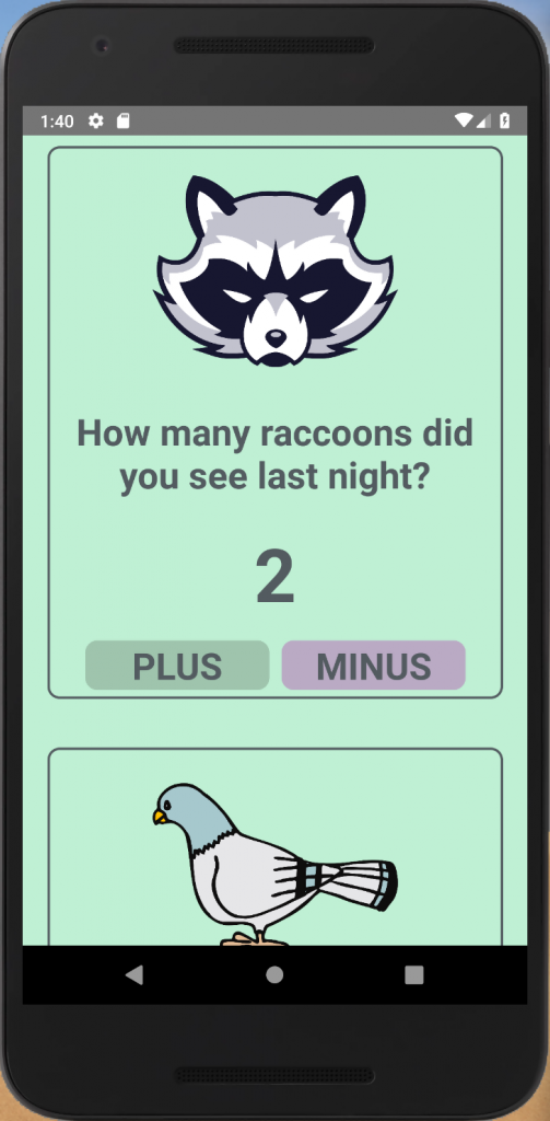
The app works! I knew it would but there are times that certain components appear differently on iOS than they do on Android. We saw these differences when working with React Native’s Button component. But in this case, the app looks and works the same on both Android and iOS.
Now for those using Expo, I mentioned at the beginning that the code used in this project would also work for you guys. To ensure this is true, I am going to copy the code and paste it in an Expo project we created a while back called, “FirstExpoProject”. Here is the app on a real iPhone X Max:
Yes, app works and looks great! It could probably use more padding at the top and bottom of the screen. Unfortunately, I do not own an Android device but since the app worked on the Android emulator, I am certain it will work on an Android device.
This is where we will leave off for this article. We added ScrollView to our app, allowing us to the ability to scroll and add more content. Then we added a new animal and passed a network image to the Image component. Lastly, using View and some new styling skills we created cards to contain each subject. I suggest you play around with the code because following steps is one thing but when you try it on your own, that’s when you really learn.
In the next article, we will continue to expand our React Native skills using this project. The code in this project was getting long and could be cleaned up. For one, we will learn about creating components and a few more things. See you in the next article.


